
Adapting to target devices
Date: 2020
Role: Head of UX Design, Motorola Mobility
Work Partners: Product teams, PM, ENG, Research
Challenge
Motorola introduced a fairly significant redesign to the preloaded Camera app in 2017 which improved usability and provided a flexible framework that could support many devices with different capabilities across the product portfolio. However, within a few years, the design seemed visually dated and, while the app functionally delivered what was needed, aspects of usability were being compromised due to the increase in longer aspect ratios and lack of visual hierarchy.

Strategy & solutions
In late 2019, I encouraged the camera design team to completely reevaluate the app design and consider what they would do differently if they were starting from scratch. The goal was to create a stronger foundation that would both resonate with users and create a solid base upon which new features could easily be added or tailored to meet the diverse needs of devices across the portfolio (e.g. cameras with single, dual, triple and quattro lenses, wide-angle, macro or specially tuned for video to name a few).
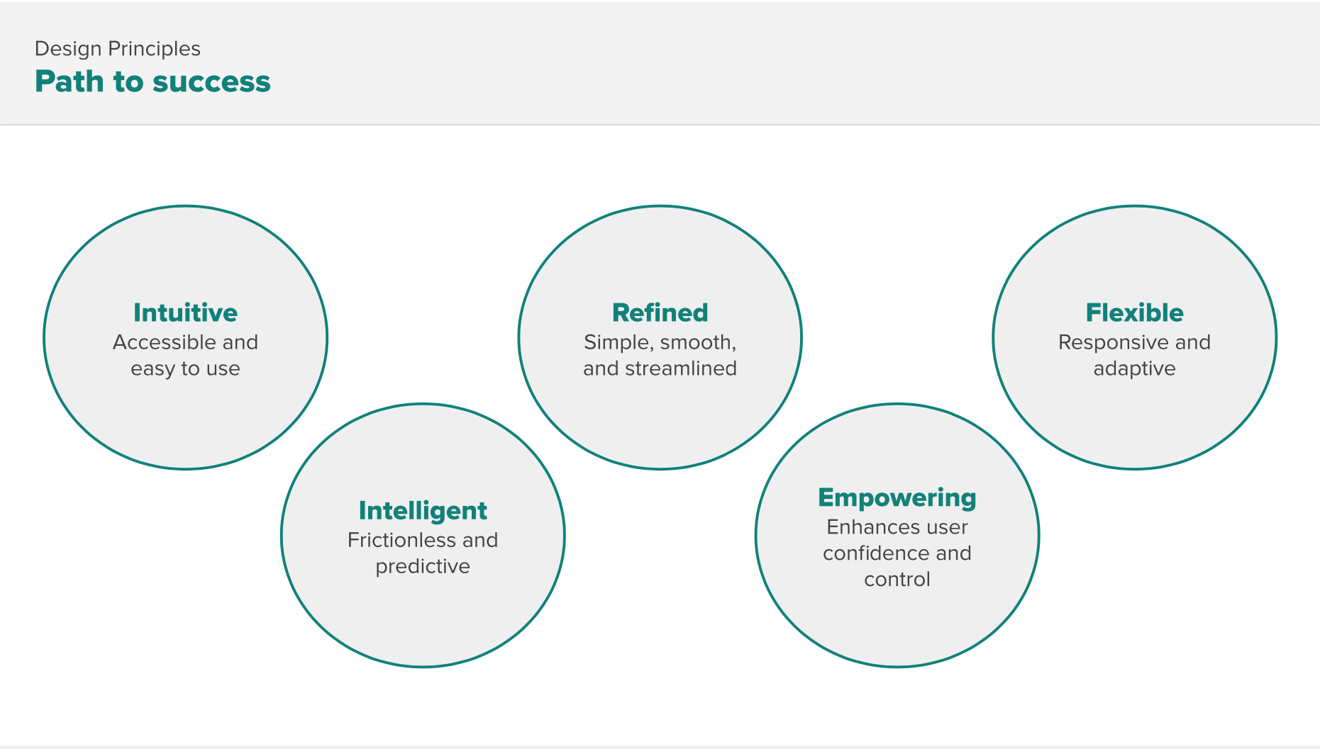
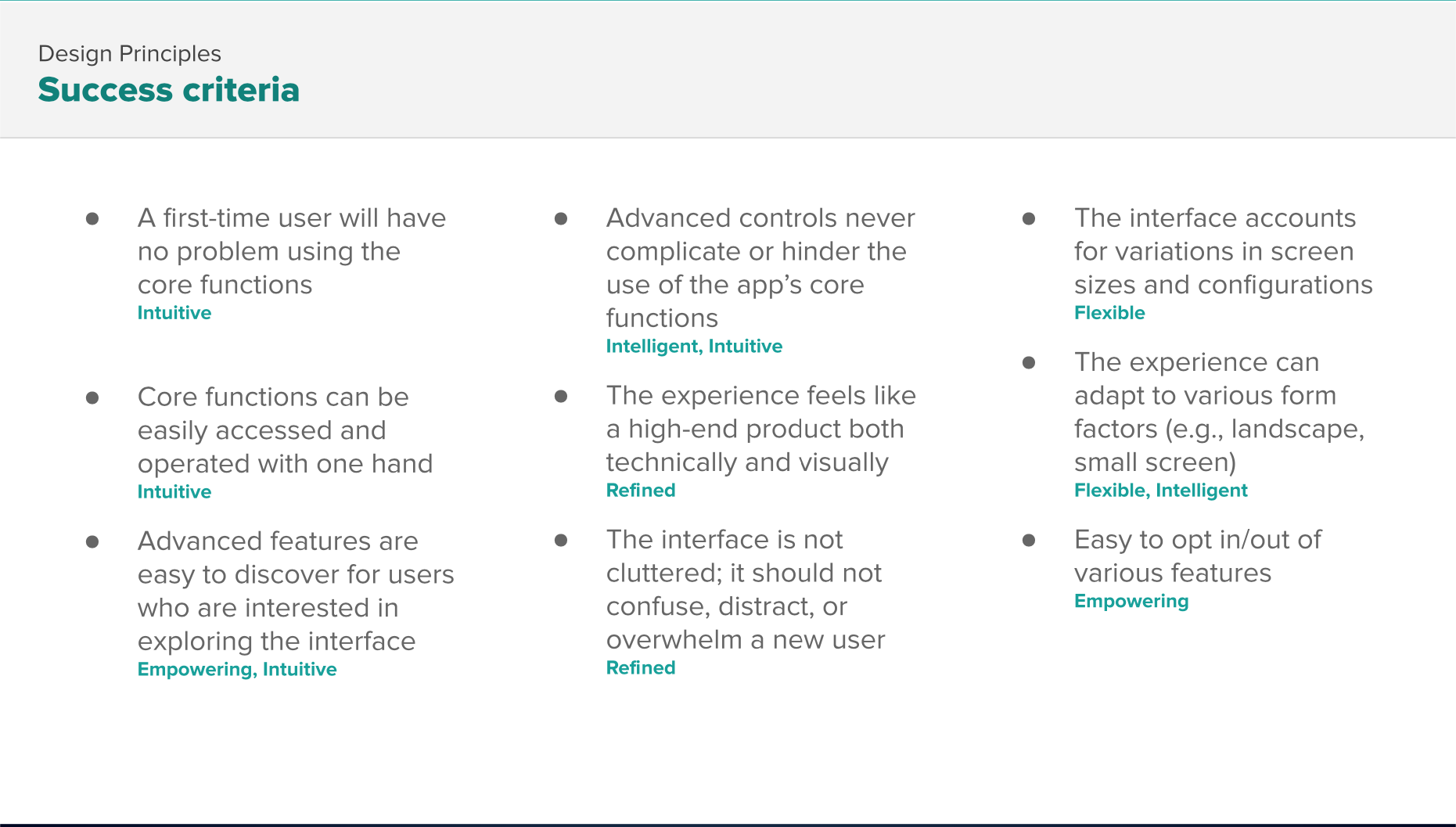
The team was intrinsically motivated to improve the camera design and quickly completed a feature inventory, as well as an evaluation of the user and business needs of the app that helped shape the guiding design principles and success criteria against which they’ve evaluated their design.
I encouraged designers to pursue multiple design directions in the early stages; four different directions were tested in the initial round. At each stage, the team narrowed some parts of the hypothesis of the design and then expanded exploration on others. The user research team conducted three rounds of research before the design team began working from home full time as a result of the coronavirus. Subsequent studies were conducted with friends & family of Motorola employees using ProtoPie prototypes which were downloaded and simulated the different interactions the team explored.
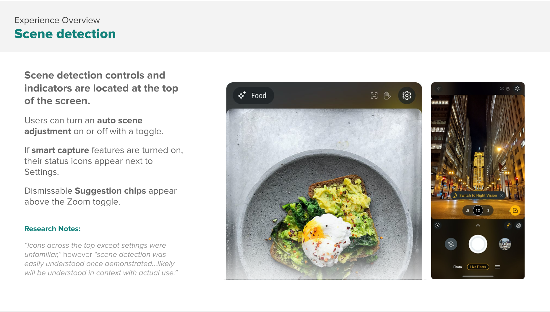
Improvements included a new viewfinder anatomy (completely revamping the visual hierarchy), improved non-blocking tutorials and tips, improved mode switching, user customization of the modes carousel, a new zoom model that accommodated various lens configurations of devices across the portfolio, and a swipe-able control panel for easy access to high priority controls.


Outcome
I believe teams should be trusted and empowered to lead themselves to execute on a goal or vision, however, this team had a few designers that had never led such a major product redesign. To be sure the project ran smoothly I utilized one of my UX leads to mentor the team, particularly cultivating the leadership of the visual designer who had the most experience with the camera app. I was particularly excited about the elevated look of the new design and the way in which the design team created new interaction patterns that were then used by designers of other apps (e.g. new tutorial and tip styles that don’t interrupt users’ main task of taking a photo when they enter the app).